.jpg) |
| Final Flyer Design |
Tuesday, May 15, 2012
Friday, May 4, 2012
Landscape Animation
 |
| Day 1 |
 |
| Day 2 |
In this project we worked in Adobe Flash in order to create a landscape animation. Our animations were to be at least seven seconds long and had to contain at least two animations/tweens. For my animation I chose to do a garden, featuring bushes with flowers, a bee, clouds, and a tree. The wings of the bee were made a movie clip so that throughout the animation they would flap. As the animation goes along, the clouds move across the sky and it appears as if you're walking through the garden, walking past the tree and to the different flowers. All of the objects in my animation were created using basic shapes and lines. The flowers consisted of circles and the tree's leaves were also made of circles. There is repetition in the flower shapes but variation in their color and size. I tried creating harmony in the piece by using similar elements, ones specific to the outdoors.
Saturday, April 14, 2012
Website
.jpg) |
| Home Page |
 |
| About |
 |
| Beauty |
 |
| Blog |
 |
| Gallery |
In this project we were to create a website that contained at least five pages. Using Photoshop/Illustrator and Macromedia Dreamweaver, we were to make a functioning website of our choosing. I made a personal website for myself, with a penguin/arctic theme. To create a harmony and unity, I chose to stick with a specific theme and color theme. The homepage shows an igloo and the banner on each of the pages has a picture of ice in the antarctic. On each of the pages there is a little penguin, Howard. Majority of the elements of my website were created from scratch using lines and shape. My final product ended up being a combination of two of my sketches. The igloo section on the homepage was the original website homepage. The banner and navigation bar was added later one.
Thursday, March 22, 2012
Web design: Home page
For our Web Design project were to use Adobe Photoshop/Adobe Illustrator and Macromedia Dreamweaver to create webpages. In this part of the project, we focused on creating a static web page. We had to come up with a subject that our websites were going to be about as well a concept for to portray it. Things such as color and font choices were important to take into consideration. Different colors represented different things. A variety of colors and fonts could confuse people and make a page cluttered. My website is a personal one to display my different artwork, makeup looks, and even cooking/baking dishes. Since my nickname is Penguin, I decided to have an igloo on my home page. The igloo was made using the 3D Revolve tool in a light ice blue color. I made the different lines in a brick pattern then Art Mapped it onto the basic igloo shape. On the blocks of "ice" that made the entrance to the igloo had the different links on the blog. The entrance itself was made using the Extrude and Bevel tool. The bright purple door brought attention to the center of the page since it contrasted with the icy blues and gays. The sign on the door had the name of my website, Penguin Paradise, and had a quick bit on what my website was about. There is unity in the piece because I kept the winter/snowy theme constant. My final design accurately represents my sketch in that it included many of the details that I drew in, such as the sign on the door and the bricks. The words on the sign were the only unstable thing since I couldn't make up my mind on what it should say.
 |
| Sketch - Portrait |
 |
| Sketch - Landscape |
 |
| Day 3 |
 |
| Final Design |
 |
| Final Design: Edited |
For our Web Design project were to use Adobe Photoshop/Adobe Illustrator and Macromedia Dreamweaver to create webpages. In this part of the project, we focused on creating a static web page. We had to come up with a subject that our websites were going to be about as well a concept for to portray it. Things such as color and font choices were important to take into consideration. Different colors represented different things. A variety of colors and fonts could confuse people and make a page cluttered. My website is a personal one to display my different artwork, makeup looks, and even cooking/baking dishes. Since my nickname is Penguin, I decided to have an igloo on my home page. The igloo was made using the 3D Revolve tool in a light ice blue color. I made the different lines in a brick pattern then Art Mapped it onto the basic igloo shape. On the blocks of "ice" that made the entrance to the igloo had the different links on the blog. The entrance itself was made using the Extrude and Bevel tool. The bright purple door brought attention to the center of the page since it contrasted with the icy blues and gays. The sign on the door had the name of my website, Penguin Paradise, and had a quick bit on what my website was about. There is unity in the piece because I kept the winter/snowy theme constant. My final design accurately represents my sketch in that it included many of the details that I drew in, such as the sign on the door and the bricks. The words on the sign were the only unstable thing since I couldn't make up my mind on what it should say.
Tuesday, March 13, 2012
Kony 2012
 |
| Flyer |
 |
| Poster |
 |
| Sticker Sheet |
Monday, March 5, 2012
CPSheet
 |
| Day 2 - Final Design |
 |
| Day 1 |
Friday, February 24, 2012
myCHARACTER
 |
| Day 2 |
 |
| Day 1 - Sketch |
 |
| Day 3 |
 |
| Day 4 |
 |
| Day 5 (edited) |
Tuesday, February 14, 2012
OH Scape
 |
| Sketch |
 |
| Day 2 |
 |
| Day 1 |
 |
| Day 3 |
 |
| Day 4 |
 |
| Final Design |
In this project we were to recreate an area within the school using our sketches as our only references. We took two class periods to sketch out the area of our choosing, getting as much details as we could. From there we were to recreate the scenes in Adobe Illustrator CS3. I chose to do an area that led into one of the courtyards. This spot was around the stairway right before you entire the business hall. With the repeating lines, I was able to create a brick pattern that created one of my walls and part of the other. The Extrude and Bevel effect was used to create different support beams and the Revolve effect helped create the smaller details on the door. Gradients also helped create a more realistic effect in the window and part of the wall. Almost each aspect of my project contains a texture similar to the real thing. The different brush strokes helped to create texture and add to the realism as well. Using a variety of beige shades I tried to mimic the actual colors of the floor, doors, and wall. Staying true to the area, I added little dents and scuff marks to the door as well as the window using lines and playing around with their transparencies. My final product is an accurate representation of my sketch in that I was able to recreate almost all the details I drew in, especially in the doors.
Monday, January 30, 2012
Doodle 4 Google
 |
| Day 5 |
 |
| Day 1 |
 |
| Sketch |
 |
| Day 2 |
 |
| Day 4 |
 |
| Day 3 |
Wednesday, January 18, 2012
mySelf
 |
| Day 1 - Sketch |
 |
Day 2 |
 |
| Day 3 |
 |
| Day 5 - Final Design |
 |
| Day 4 |
In this project we were to create a self illustration using different objects that reflect our interests and personality. Just as with the previous self illustration project, we were to work in Adobe Illustrator CS3. My design included me with curly hair; vines, a strand of rosary beads, as well as makeup brushes serving as different strands of hair. The nail polish brush and different bands of color are straps of a top. My nose is made up of feathers and my mouth is a cupcake. The eyes feature one with a pokeball, the other with the sign of Gemini, Sneasel feathers for eyelashes, and penguin footprints for eyebrows. By making the different facial features proportional in size I hoped to make it more realistic. Using gradients allowed me to create a three dimensional effect. The variety of colors used are from my love of color and lines were used to create the different objects. My final product resembles my sketch. Only a few details were changed such as the placement of vines, the use of the feathers as the left shoulder straps.
Tuesday, January 17, 2012

Sunday, January 15, 2012


Tuesday, January 10, 2012
 |
| Day 1 - Sketch |
 |
| Day 2 |
 |
| Day 3 |
 |
| Final Design |
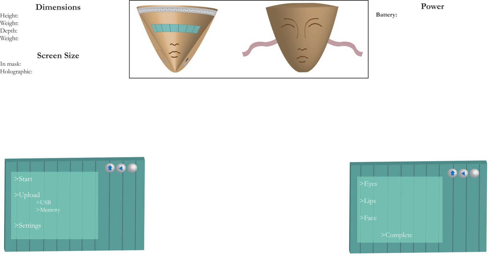
In this project we were to use Adobe Illustrator CS3 to create a 3D rendering of a product we have invented. We were to use our knowledge of 3D effects such as Revolve and Extrude & Bevel. The art mapping option enabled us to map a 2D design to the surface of a 3D object. My product was inspired by an invention in a movie. It is a mask that can do a full face of makeup with just the push of a few buttons. The mask is intended to cover the whole face, with a screen being visible once on. The shape of the mask was to mimic the shape of a real person's face, with the features of the face on the front. I made the size of the facial features proportional and similar to a real face. The gradation created by using the 3D effect made the mask look more realistic. My sketch was much simpler than my final product. The details were thought of but added onto the project as I worked on it.
Subscribe to:
Comments (Atom)