Wednesday, November 9, 2011

Tessellation

Final Product
Day 2
Day 1
Day 3

In the Tessellation project we were required to create our own tessellation design in Adobe Illustrator CS3. The technique was used in our previous project, the color wheel. My final product was inspired by one of my favorite pokemon, Sneasel. I included a snowflake since it is an ice type, as well as its signature feather like appendages. I used the colors of the actual pokemon, changing the dark blue to a lighter teal to create more constrast with the pink of the feathers. The original pannel was repeated to create the base hexagon as well as the "petals" around the edge. My final product does accurately represent my sketch in that it is almost identical except for a few details.

Color Wheel


First/Last Day
  
In this one day project, we were to create a color wheel using Adobe Illustrator CS3. We used the Line Segment tool, Rotate tool, and the Live Paint Bucket tool. We were to use the directions given to create a wheel similiar to the one in the tutorial. The repetition of line segments divided the outer most circle and the triangle. The different secondary and intermediate colors surrounded the primary ones within the triangle in the middle. Since it was a one day project, we weren't required to make a sketch.

Wednesday, November 2, 2011

Watermark Logo

Day 1 - Sketch 
Day 2
Day 3 - Final Design
In this prject were to create a logo that represents ourselves to use as a watermark for our future projects. As with the other logo project we've done, it was to be made in Adobe Illustrator. But unlike that project, we were to keep this logo black and white. My final project included a penguin, the letters L and J, and the sun from the Filipino flag. I used a penguin because it's my favorite animal and one that my friends associate with me. Lj is a nickname that a good friend of mine gave me a while back and it stuck. Those two elements were in the center of the logo, emphasizing them. The rays of the sun come from the Filipino flag, repeating them gave my piece variation. I made sure the lines that made up the rays were straight and symmetrical. My final design ended up being a combination of two sketches I came up with, a penguin and the sun with my nickname in the middle.

Tuesday, October 25, 2011

TypoSCENE

Day 1

Day 2
Day 3
Day 4 - Final Design


In the TypoSCENE project, we were to use Adobe Illustrator CS3 to create a scene using typography. We were to incorporate the object from the previous project and place it into a scene. To create this we were to once again use the envelope distort option to make the objects via the pen and type tool. Adding onto the previous project, we had to use color.
For my project I chose to create a portion of a room, consisting of a bed, the floor, and the phone I created in the other project. The phone is now colored and placed ontop of the bed, being charged. To create more contrast and variation, I decided to have one corner of the comforter folded over instead of just laying flat on the bed. By creating a curvier shape, I was able to mimic the way an actual blanket would fold, making it look more three-dimensional. I used different shades of blue on the phone to make it accurately represent my sketch. I also decided to make the flower details on the comforter, though I should have made them in a more vibrant color to contrast them with the darker background color.

Tuesday, October 18, 2011

Art Show


Day 2
Day 3


Day 4
Day 5 - Final Product


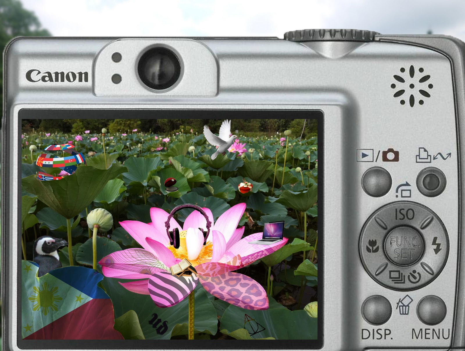
This project is different from ones we've done so far, this one we had almost complete freedom over in terms of what we could do. We were to create our pieces using either Adobe Photoshop CS3 or Adobe Illustrator. In this project we were to combine the skills used in previous projects to create a cohesive piece.
For my final project I decided to do a form of a collage, using different elements that represented me. It is a scene with a lotus flower being viewed through a camera. Using different animal print, I manipulated the patterns to make it look as if they were on the petals of the flower themselves instead of just ontop. I did the same thing with the Filipino flag on one of the leaves. In the background you can see a few objects integrated with the leaves. By changing the value or opacitiy of certain things, like the patterns, I tried to make everything more cohesive and as though the objects I added in were actually part of the scene captured by the camera. With the lighting in the picture, the main focus was the lotus blossom. To give it more emphasis, I decided that that was where I'd try to add in more details. My final product does accurately represent my sketch in that I was able to recreate many aspects of it, such as the scene being within the camera screen and having the flower be the main focus. There were more details in my final product however.

Monday, October 10, 2011

Zombify!

Day 2


Day 1


Day 3 - Final Project


In the Zombify project, we were expected to create a zombie/horror version or our picture in Adobe Photoshop CS3. We were to apply different textures and gory affects to make ourselves appear dead and have our background match appropriately. In my final project I had used bloodshot zombie eyes and a peeling paint texture to make it appear as if my skin was rough and cracked. The different bruises, wounds, and use of blood added to the whole effect of making me seem dead. By darkening the rest of the background I brought emphasis to me. To give the picture harmony and unity, I added effects to parts of the picture other than my face. By keeping the handprints and blood splatters a relatively smaller size, I made sure to keep things proportional. For this project, we weren’t required to draw sketches so my final project doesn’t have anything to represent.

Monday, October 3, 2011

TypoObject


Day 1 - Sketch
Day 2

Day 4

Day 3

Final Project


In the TypoOBJECT project, we were to continue to use Adobe Illustrator CS3 to create a composition exploring typography. In this particular project, we were to use the envelope distort option to create an object of our choice via the pen and type tool. As with other, projects, our document was to be 8.5 x 11 inches and we could only use one font. But in this project we weren't allowed the use of color, instead we had to experiment with the opacity of different aspects of our projects.
Each part of the object we chose had to be made using the object's name or the name of its different parts. For my project I chose to do a phone, specifically my own phone. I made sure to include the many details such as the keypad, speaker, and other various buttons. The repetition of the various words create the illusion of a solid object, when in fact, its multiple words formed in a shape. By changing the opacity of the different layers, I created contrast and changed the value of the different parts. I was sure to make the different parts of the phone, such as the screen and buttons proportional to stay true to my sketch as well as the actual object. My final project does represent my sketch in that they’re both at the same angle and that my project includes all the details seen in my sketch.